Most Popular:
Specials:
Business Cards:
Stationery:
Promotional:
Find Us on the Net:
FAQ
- FILE SPECIFICATIONS
- FILE TYPES
- FILE FORMATS
- SCANNING
- DIGITAL CAMERA IMAGES
- COMPUTER VS PRINTED IMAGE
- RGB VS CMYK
- RESOLUTION
- RICH BLACK
- GRADIENTS
- VECTOR VS BITMAP
- FONTS VS OUTLINES
- BOUNDING BOX
- ONE FILE PER PRODUCT
- PAPER SIZES
- JOB SIZES
Are you going to supply us with print ready artwork files?
If so checkout our tips, they will help your artwork print correctly.
File Specifications
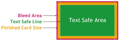
Text Safe Area:Our standard text safe area is 3mm smaller on each edge than the finished size of the card. Inside this area is safe for all information to be as well as graphics. If there is any text or graphics outside this area then there is a chance that it will get cut off when the job is trimmed.
Bleed:
When an image or a colour is printed to the edge of a page, the image or colour should extend at least 1.5mm off the edge so that when the page is trimmed on a guillotine, small variations in the trim will not result in a white line down the edge of the page.
Here are a few tips to follow to ensure a smooth workflow:
- We prefer it if you could supply your file as a PDF, to our specifications. If that’s not an option for you, please keep these points in mind:
- All colours to be CMYK, RGB or PMS (Pantone Matching System). NO HSV or INDEX COLOUR files!
- Check your specified colours against the CMYK or PMS Colour chart. Screen colours generally don’t match or give a true reflection of what will print.
- Supply all fonts used if possible - or convert all fonts to paths or curves - see "Fonts vs Outlines".
- All pictures need to be 300dpi at actual printed size for maximum quality, any bigger is a waste of space, any smaller the quality drops! See below for an explanation on resolution.
Text & Graphic Formats
- Text: ASCII, MicroSoft Word, RTF, Plain Text or similar is preferable.
- Graphics: For scanned Photos & Logos (Bitmap Graphics) 300dpi at 100% full size saved as TIFF, EPS or JPEG.
Back to top
What types of images will work ok?
If you are scanning the images yourself from
photographs it is better to save them in either TIFF or EPS format. These image formats will preserve the colour and sharpness of your
pictures the best. File formats like GIF or JPG compress the pictures colour and
pixel resolution and this can cause colour shifts and blurriness. Since JPG and
GIF are the most predominant image formats on the web, it follows that it’s not
a good idea to simply lift an image from someone’s website and use it in your
layout.
Back to top
What file formats do we accept?
We prefer PDF files ready for print, to our specifications (see above).If you can’t supply a PDF, we used to work mainly in Freehand. We are in th eprocess of converting all our legacy Freehand files into Ilustrator; thi scan only be done in version 5.5, hence we’re not upgrading any time soon to the laterst version.
We can also accept files from Adobe CS5.5 for Mac (InDesign, Illustrator, Photoshop, Acrobat) and MS Office 2013 for PC (Word and Publisher only; Powerpoint and Excel files are generally not suitable for print).
Files like TIFF, EPS, AI, Freehand and PSD are all fine. If you want to supply a JPG, please make sure you work on your file in 300dpi TIFF format and save as JPG as a last step. Re-saving as JPG degrades the image; and working on a low resolution file before upscaling to 300dpi will not improve quality (especially text will look very jagged and may even be illegible).
FREEHAND - After PDF, these files are the best for us. Just remember to supply all links and fonts used (or convert text to paths - see "Fonts vs Outlines").
Download Freehand Templates
IN-DESIGN - up to CS5.5. Please make sure to supply all the links, and supply all fonts files used (or convert fonts to paths/curves - see "Fonts vs Outlines").
Download In-Design Templates
PHOTOSHOP - either CMYK or RGB. 300dpi. Leaving layers unflattened lets us alter your file, but font issues can occur. We would really prefer it if you could supply us a flattened TIFF.
Download Photoshop Templates
ILLUSTRATOR - up to CS5.5. We are coming to grips with Illustrator: it seems it can open our thousands of legacy Freehand files. We’re slowly learning to use it :)
Same rules regarding links and fonts apply as to Freehand and InDesign.
Download Illustrator Templates
MS PUBLISHER up to 2003 - supply font files used if possible.
Download MS Publisher Templates (to come)
If you are working in QUARK, PAGEMAKER or CORELDRAW please create a PDF, or export the file as an EPS. Please don’t forget to add the bleed (create a white background to the full size including the bleed). We will convert to PDF ready for printing and email you a proof before we print.
Download CorelDraw Templates
If you are working in a SIGNWRITING PROGRAM then the same applies: if possible create a PDF, or export as an EPS or an AI file (even a TIFF).
Back to top
Scanning
You should scan your images using a resolution
of 300dpi at the final dimensions you intend to use them so that your colours
will look smooth, and hard objects will look sharp. In other words don’t scan
at 300dpi and then enlarge the picture by 200% in your layout program! This is
another reason why you should not use images that are lifted from websites;
they are probably only 72dpi in resolution and will look very blurry if printed
on a printing press. See below for more information on
resolution.
Back to top
Digital Camera Images
If you are using pictures from your digital
camera they will work just fine if they are JPGs; the
quality of JPG images from digital cameras seems to be much better than JPGs
that are used on the web. You must do the math to make sure that it is high
enough in pixel resolution though. For instance, if your camera puts out a
typical image of 1280 x 960 pixels at 72dpi you get about 45cm x 33cm of
photograph (at 72dpi); this is the same amount of detail as an image which is
10cm x 8cm at 300dpi so it’s safe to reduce or enlarge that image in Publisher
up to about 10cm x 8cm in dimension.If you need to make changes to your original image, please first save it as a TIF so the image quality doesn’t degrade every time you save it as a JPG. TIF images don’t degrade.
Back to top
Will my printed piece look exactly like it does on my computer monitor?
There are some small differences. As far as photos and other bitmapped images goes, scanners and
digital cameras create images using combinations of just three colours: Red, Green and Blue (called "RGB"). These are the
colours that computers use to display images on your screen. But printing
presses print full colour pictures using a different set of colours: "CMYK" - Cyan
(blue), Magenta (red), Yellow and Black ("key" - mainly for text and shadow areas in images). So at some
stage your RGB file must be translated to CMYK in order to print it on a
printing press. This is easily done using an image editing program like
PhotoShop, but our RIP (computer that controls our digital printers) is very capable of converting RGB images into CMYK on the fly and often gives better results than converting in Photoshop. This means we are quite happy to accept RGB files.Back to top
It is possible to make colours in RGB that you can’t make with CMYK
They are said to be "out of the CMYK colour gamut". The difference between "subtractive" and "additive" colours: RGB works with light, adding colour (to the black starting point of the monitor) to create white; CMYK works with ink or toners, subtracting colour (from the white starting point of paper) to create black. What happens is that the translator in the software just gets as close as
possible to the appearance of the original and that’s as good as it can be.
It’s something that everyone in the industry puts up with. So it’s best to
select any colours you use for fonts or other design elements in your layout
using CMYK definitions instead of RGB.
Or choose colours from our PMS colour charts, which have been printed on our printers. Back to top
Resolution (DPI)
DPI stands for (dots per inch). If you have a
picture/scan within your layout/graphic program, remember that the resolution
(DPI) must be correct. For a good quality image to print properly, the DPI (at the printed size) needs to be 300dpi.
Printers print images at 300dpi (dots per inch). Monitors display an image at 72, so images published onto the Internet are generally 72dpi JPG images. This speeds up download time (72dpi images are much smaller in file size than 300dpi images). JPG is a "lossy" compression format, where the more you compress the image, the more it degrades. Also, each time you save a JPG, it re-compresses the already compressed image. For these reasons Internet images are unsuitable for printing.
To give you an idea of what a 72dpi image looks like when printed, we have taken our original premises pic (at 300dpi) and downsampled it to 72dpi (the centre pic). This is perfect for displaying on a monitor, i.e. on the internet (like this website). However, if we try to print this 72dpi image on a 300dpi printer, we need to enlarge it - blow it up. (See below for an explanation on the relationship between resolution and size). To show you the effect this has, we zoomed in to 2 different areas of the original 72dpi image (by upsampling them to 300dpi, as we would need to do if we were to print them), cropped them to the same size as the original pic (595 x 249 pixels) and put them side by side for you to compare (top and bottom images):


The zoomed-in images are much more blurry - unacceptable for printing. (The "blockiness" you see in the enlarged images are actually JPG artifacts. For this reason we advise not to use low-resolution JPG images for printing!)
We’ll explain "dpi" and size: It’s all to do with "Dots per Inch" - or Pixels Per inch. A monitor is a mechanical device which needs pixels to display an image. Per linear inch, only 72 pixels will fit. A digital printer however, uses a laser beam to create an image. These beams can be much smaller, so 300 beams can fit into an inch. (Sometimes more, but this has no discernable effect on the quality of the image).
Now, take that "inch": Our sample image above is 595 pixels wide. On a monitor, which displays just 72 dots (pixels) per inch, this image is quite large - just over 8 inches in fact (595/72=8.2"). Now we print this same image on our 300dpi printer, and suddenly it’s much smaller: 595/300=1.98" (just under two inches). Or, if we do print it at the actual size, it will look blurred (like the examples above).
Resolution is a tricky subject to explain, but we hope this was helpful for you :)
Back to top
Rich Black
When you want an area of solid black within the document, please do not use a mix of all 4 colours - this will make the black look murky.
100% black (K) is enough for our digital printing press; for offset printing use Rich Black, which contains a mix of C:40% and K:100%.
Back to top
Gradients
Gradients are areas of colour that flow from one colour to another. This occurs in steps (or "bands"), hopefully invisible to the naked eye.
Gradients are commonly used in printing and in most instances work fine.
However, when a gradient is used it is crucial that it should be created in Adobe Photoshop, which has proven to give better results.
Vector programs like Illustrator, Freehand and CorelDraw, which produce images using mathematical descriptions, may produce gradients with visible banding or striping, which frequently makes customers unhappy.
Again, there’s a relationship between resolution and number of bands possible in the gradient. The higher the resolution of the printing device, the higher the possible number of bands. Imagesetters, used to create film or plates for offset presses, generally have a higher resolution (2400dpi) than digital printing presses (300dpi). The higher the number of bands in a given area, the smaller the band. So if you want to fill the background of a business card wigh a gradient, this should be fine for a lower resolution digital printer. But if you want the gradient to fill a full A4 sheet, the bands of the gradient will be much larger and you will get more visible "banding". In Photoshop you can apply a gaussian blur filter on the gradient to make the bands less visible.
One final note: please be careful with your choice of start and end colours: the in-between steps may turn out quite murky.
Back to top
Vector versus Bitmap Images
Vector drawings are defined mathematically.
They are Resolution-Independent, so they can be scaled to any size with
absolutely no loss of quality. Bitmaps are defined by their pixels, so they
cannot be scaled to larger output size without loss of resolution.
Back to top
Fonts vs Outlines
Creating outlines of your text solves some font problems - it eliminates the need to send fonts along with your files. However, when we print a file, our RIP detects a font and will treat it as such. This means that black text will automatically overprint a colour background for example, and remain nice and sharp. However, when text has been converted to paths/outlines, the text becomes a bunch of vector objects. The text may look blurrier - this is especially true for coloured text on a colour background.
Back to top
Bounding Box
When you create an EPS from Adobe Illustrator, you must include a transparent object which represents the overall dimensions of the product. For example, with a business card, a box that is 93 x 58 mm which surrounds the objects on your art board. Without this surrounding box, Illustrator will think the size of the job is the total size of the objects on your page - not the full page! All our templates include a bounding box, including the bleed. You can download product templates here.
Back to top
One File Per Product
One file for each product ordered please! We cannot accept PDF files that have been laid out with multiple page sizes. We can however accept multi-page files for one product - i.e. business cards that are printed front and back, and/or for multiple persons.
If you’re also ordering Letterheads for example, please supply a separate file. Back to top
Understanding Paper Sizes
It is useful to understand a little about standard paper sizes so that you can keep wastage with your print jobs to a minimum. We print onto SRA3 (320 x 450 mm). Two A4’s will fit onto SRA3, including bleed and crop marks.
A Series
A Series is used for most types of general printing i.e. Stationery, publications, brochures and flyers etc. The most common sizes are A4 for stationery and documents, A5 for books and A6 for postcards.
Below illustrates the relationship between the different A sizes. You’ll see that all the sizes are in proportion to one another, with A3 being twice the size of A4, which in turn is twice the size of A5 and so on.
|
SIZE |
MM |
| A6 | 105 x 148.5mm |
| A5 | 148.5 x 210mm |
| A4 | 210 x 297mm |
| A3 | 297 x 420mm |
| SRA3 | 320 x 450mm |
C Series
C Series is used for envelopes, designed to take A series paper.
C4 is used for A4, C5 for A5 and so on. DL envelopes take A4 sheets, folded into three.
|
SIZE |
MM |
| C6 | 114 x 162 mm |
| C5 | 162 x 229 mm |
| C4 | 229 x 324 mm |
| C3 | 324 x 458 mm |
| DL | 110 x 220 mm |
Back to top
Standard Job Sizes
Product templates are available here.BUSINESS CARDS:
90 x 55mm (With bleed 93 x 58mm)
LETTERHEADS:
A4 (210 x 297mm - With bleed 213 x 301)
COMPLIMENT SLIPS:
210 x 99mm (With bleed 213 x 102mm)
POSTCARDS:
100 x 145mm (With bleed 103 x 148mm)
RACKCARDS:
99 x 210mm (With bleed 102 x 213mm)
Back to top
Contact Mark at Same Day Printers :: Phone 03 365-4516 :: info@samedayprint.co.nz :: 307 Brougham Street, Christchurch